Tedif
A Webflow website with distinct routes for founders and investors.
Visit the live website- Industry
- Venture Capital
- Service
- Website Design
- Platform
- Webflow
- Audience
- Startup founders seeking investment and prospective fund investors
(01)Results
- Funding applications
- 23
- Investor enquiries
- 14
- Completed applications
- +52%
(02)Overview
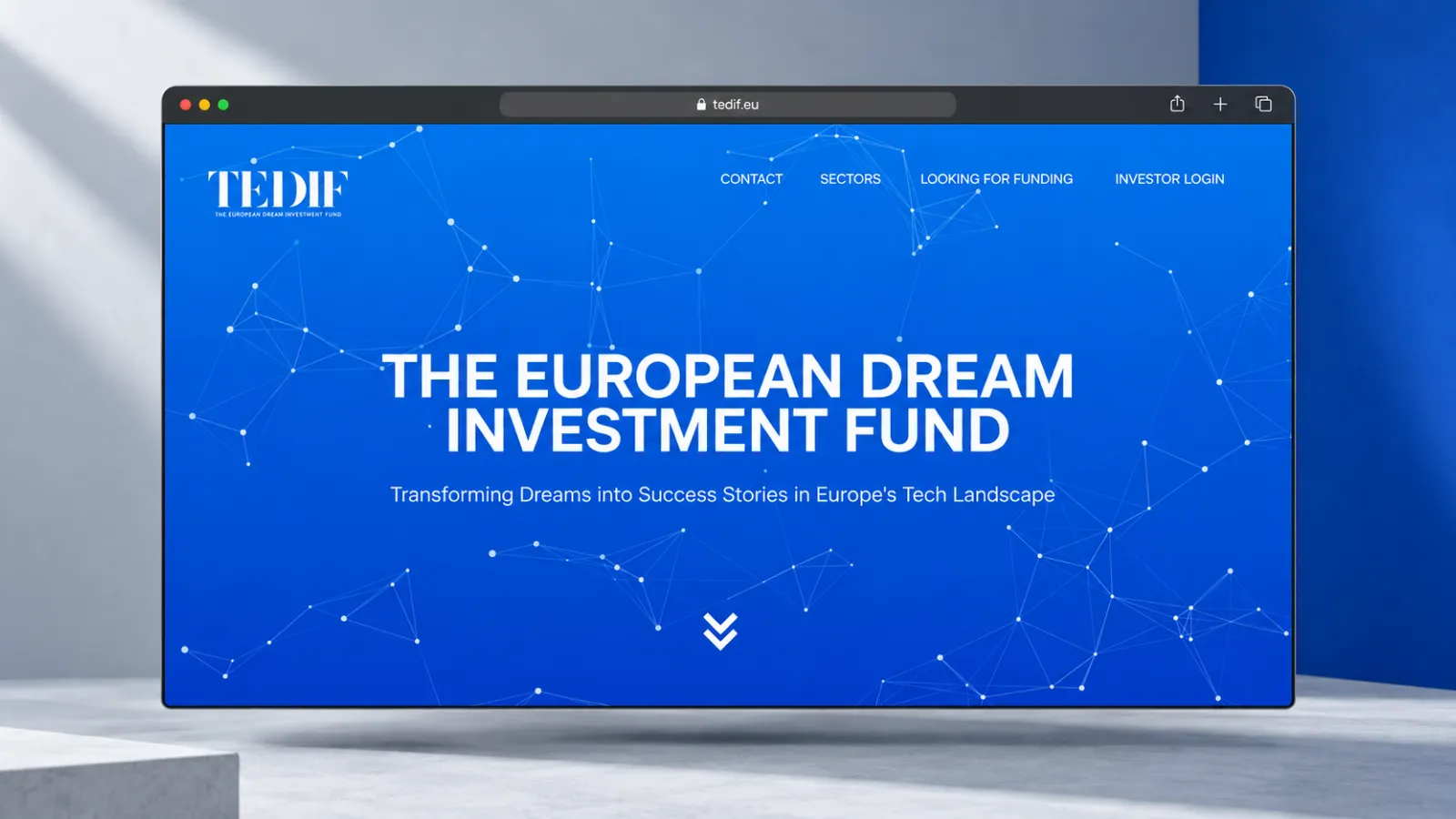
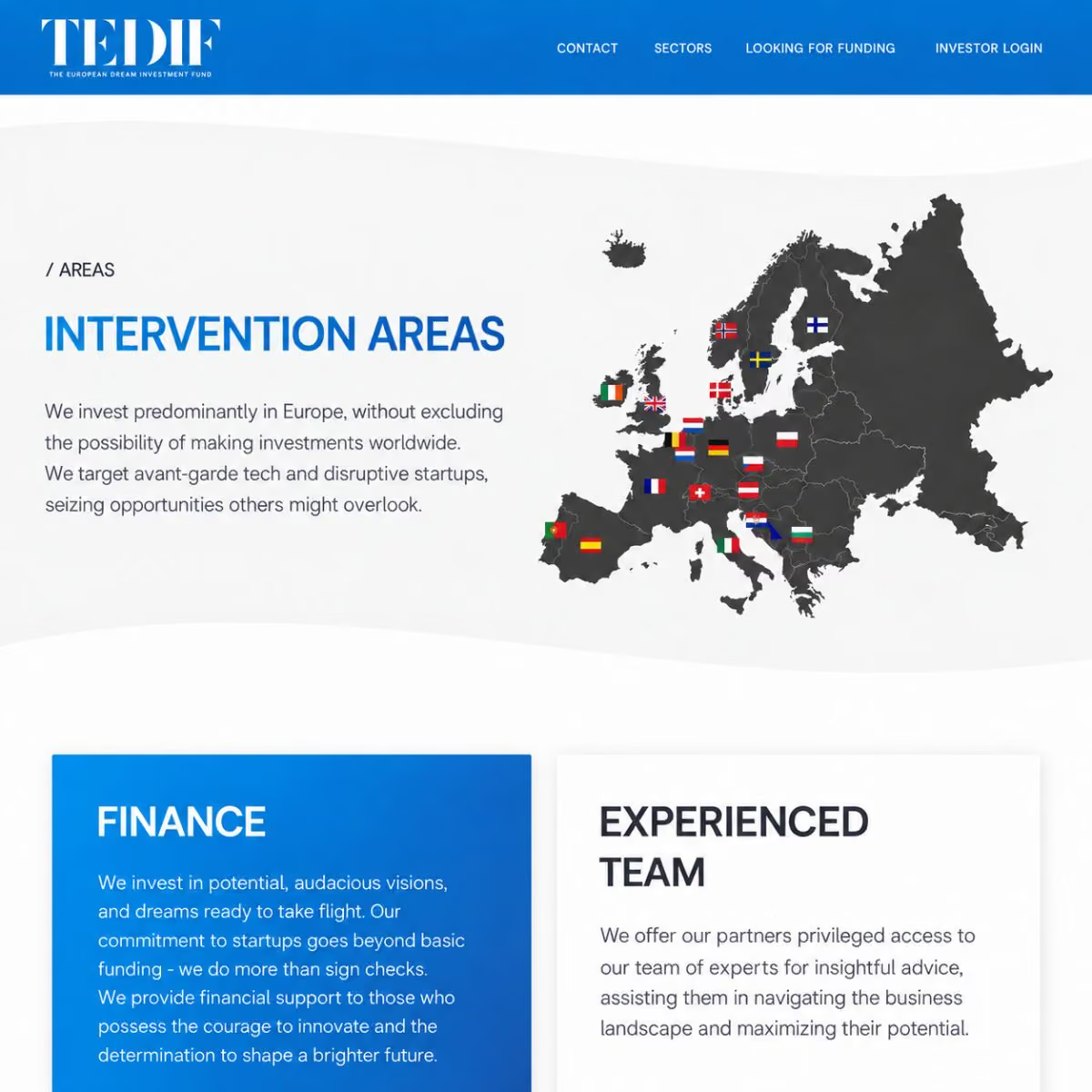
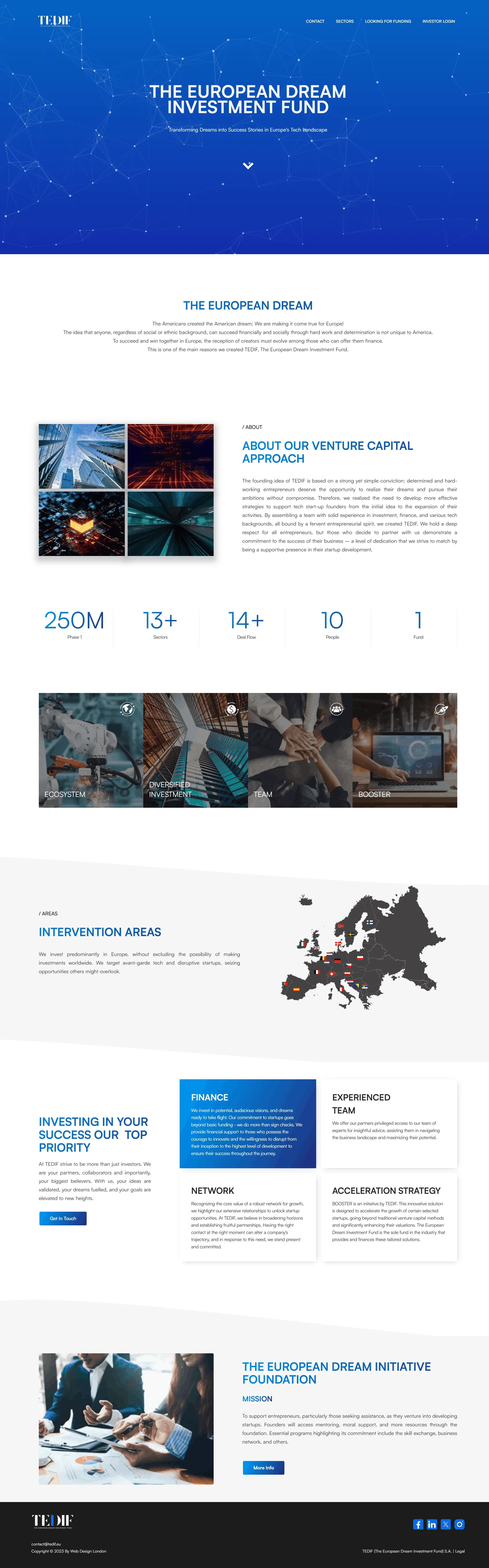
TEDIF is a Luxembourg venture capital fund focused on technology startups. Its site had to present the investment approach to founders seeking funding and to prospective fund investors. We designed and developed the Webflow website around the fund's mission, approach and sectors, giving founders and investors their own entry point within one shared presentation.
- 01
Website design
A clear visual hierarchy for the fund's mission, approach and sector focus.
- 02
Audience pathways
The needs of startup founders and prospective investors separated, each with its own next step.
- 03
Webflow development
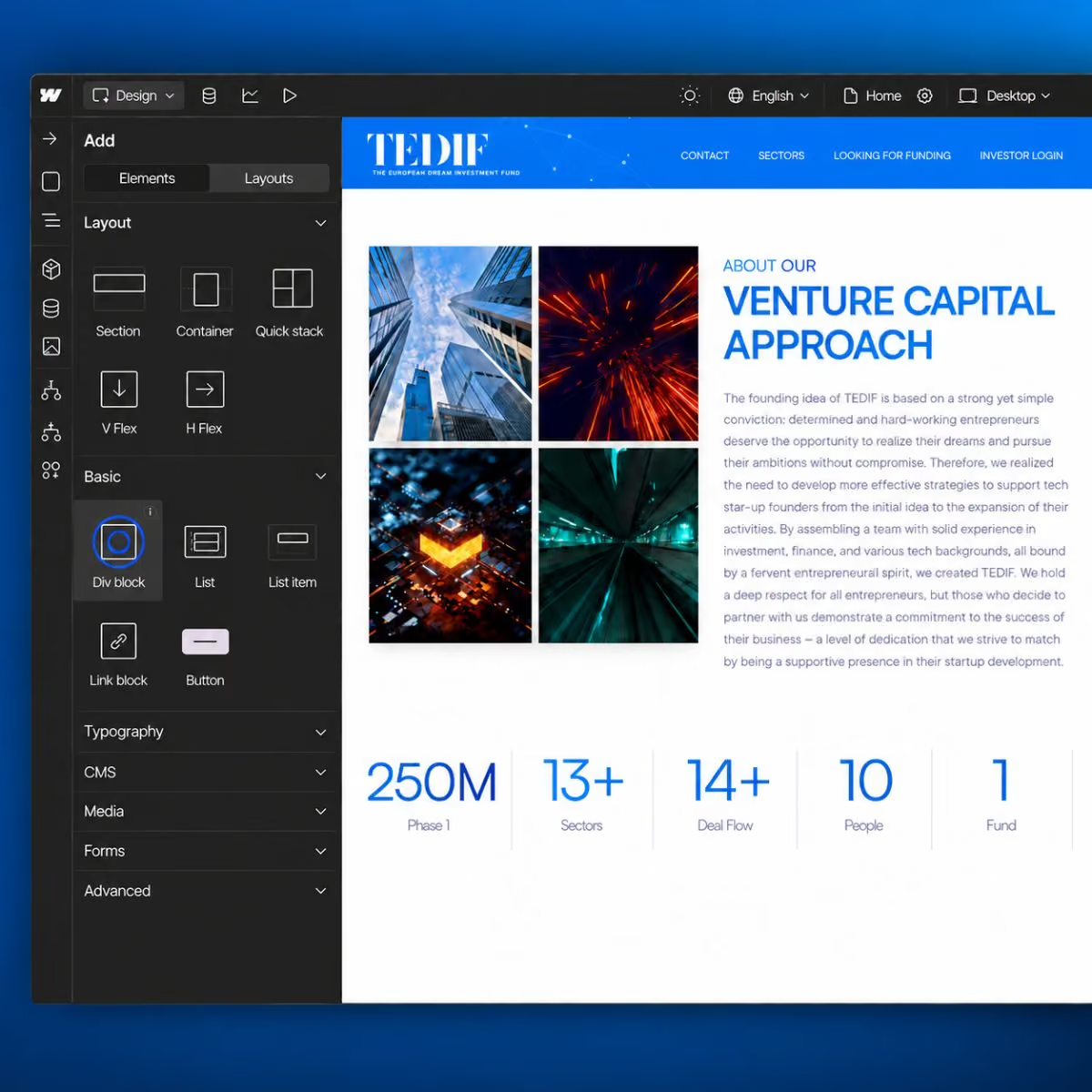
The fund narrative, sector information and portfolio content brought together in Webflow.
- 04
Funding and access
A funding submission route and an investor login entry point connected to the website.
(03)The approach
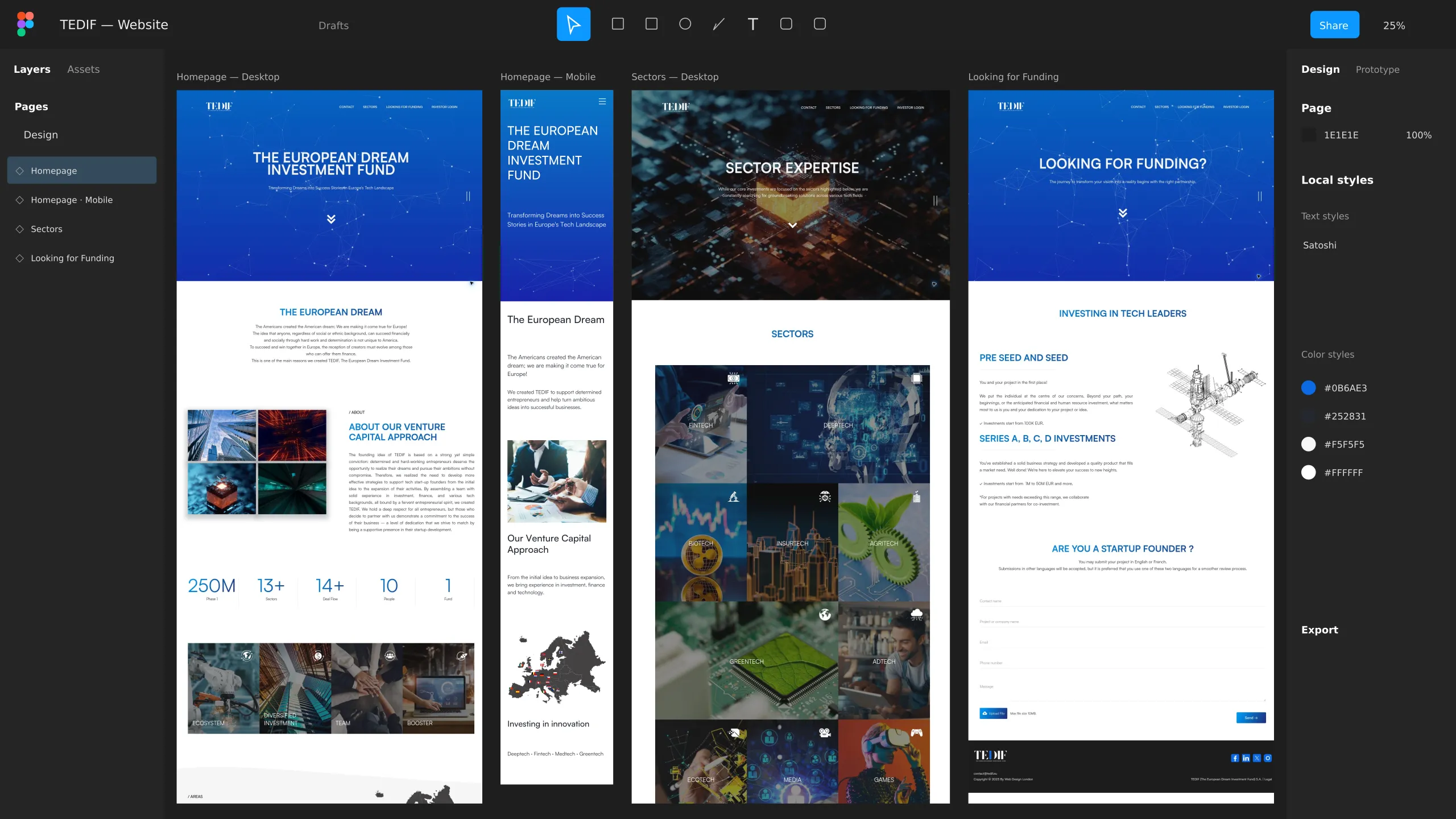
Explain one investment proposition while supporting two different decisions.
Founders need to assess whether their business fits the fund and learn how to apply, while investors need the fund's focus. Both start from a shared introduction before their paths split.
(04)Collaboration
A shared fund introduction followed by clear founder and investor routes.
Stage 01
Discovery
Review the fund's mission, investment focus and the information needs of founders and investors.
Stage 02
Structure
Design the page hierarchy and separate calls to action around those two audiences.
Stage 03
Implementation
Develop the responsive Webflow pages and organise sector and portfolio content.
Stage 04
Delivery
Connect the funding submission route and investor login entry point within the website.
(05)Design language
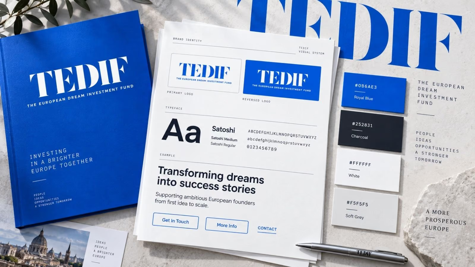
A confident identity with a clear information hierarchy.
Bright blue, white and charcoal establish a crisp visual foundation, with bold serif branding giving the fund its confident voice.
(07)Client review
The website is functioning perfectly, and I really want to say again that you and your team did a great job.
Livit.Design